
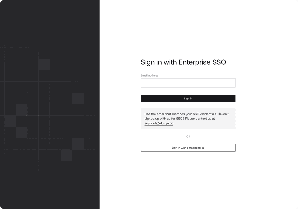
Protect humans from scams
Final solution
Screenshot from the final solution


Introduction
Alt**ya is a company that specializes in proactive fraud prevention within the web3 ecosystem. We offer cryptocurrency financial services, providing real-time visibility for cross-chain transactions and asset allocation.
Alt**ya's solutions analyze wallet activities to empower decision-making and prevent fraudulent activities, thereby fostering trust among users.
My role
Taking on the role of a researcher, UX designer and UI designer, I came up with a design solution for the web application. I also did some redesign work as well as added newer features to improve our business standing amongst competitors.
Below are some design explorations during the design phase
What problem did we face?
Alt**ya is addressing the challenge of fraud and security in cryptocurrency transactions, which is a significant concern in the rapidly evolving web3 and crypto ecosystem. By offering solutions that analyze and monitor transactions in real-time, they aim to help businesses like crypto exchanges and payment platforms reduce financial losses due to fraud and create a more secure environment for their users.
How did we understand the problem & creatively solve it?
Process:
User Research:
Conducted in-depth interviews with both successful and dropped-off users.
Analyzed existing customer data and feedback.
Problem Identification:
Initially hypothesized that reducing steps would improve completion rates.
Further investigation revealed trust-building as the critical factor.
Design Exploration:
Focused on redesigning all the steps
Developed multiple prototypes emphasizing transparency.
Iterative Testing:
Conducted quick A/B tests with different elements with customers.
Gathered real-time customer feedback on new designs.
Implementation:
Rolled out the redesigned web app with better experience & look.
Incorporated "trails" to help users understand .
Monitoring and Optimization:
Closely tracked completion rates and user feedback post-launch.
Continued iterative improvements based on ongoing user insights.
Requirement gathering
Competitors analysis: I actively analyzed our competitors to understand their strengths and weaknesses, allowing me to identify gaps where we can develop effective design solutions.
Spoke to stakeholders: Since we were new to the market and in the process of acquiring customers during the design phase, I primarily engaged with stakeholders to gain insights into the challenges our potential customers were facing, as I did not have direct access to them at that time.
How can we design a solution for businesses where they monitor fraudulent crypto transactions to help their customers avoid scammers?
Identifying the gaps of the old UI
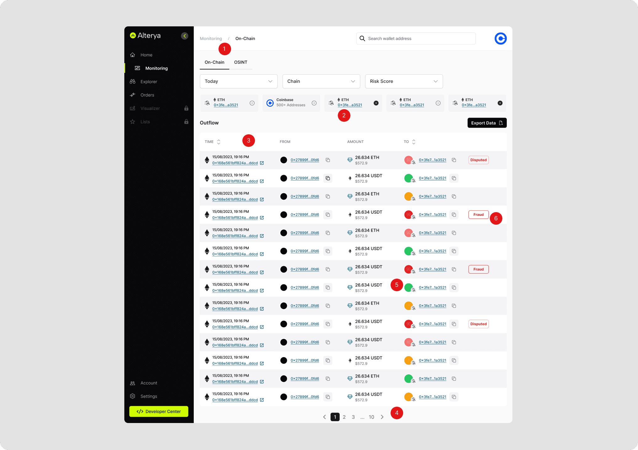
Navigation: small title, double navigation
Chains: list of chains isn't scalable
Table header: doesn't show a total of all transactions
Pagination: isn't positioned well
Risk score: not readable, contrast is bad
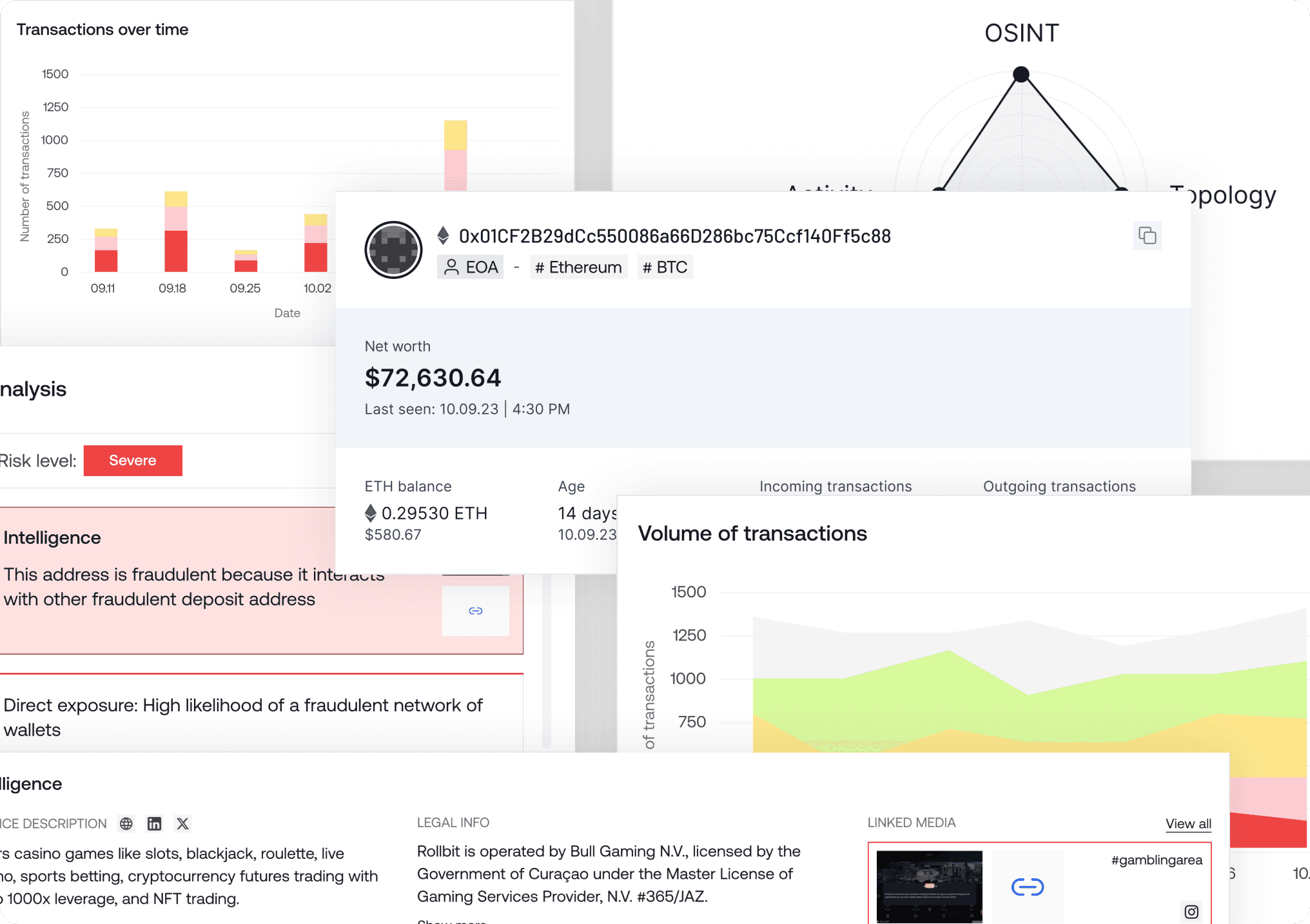
Data visualization: none
Overview: no overview of how many transactions were monitored
Risk level: not proper differentiation between different fraud categories
Improvement on the old UI
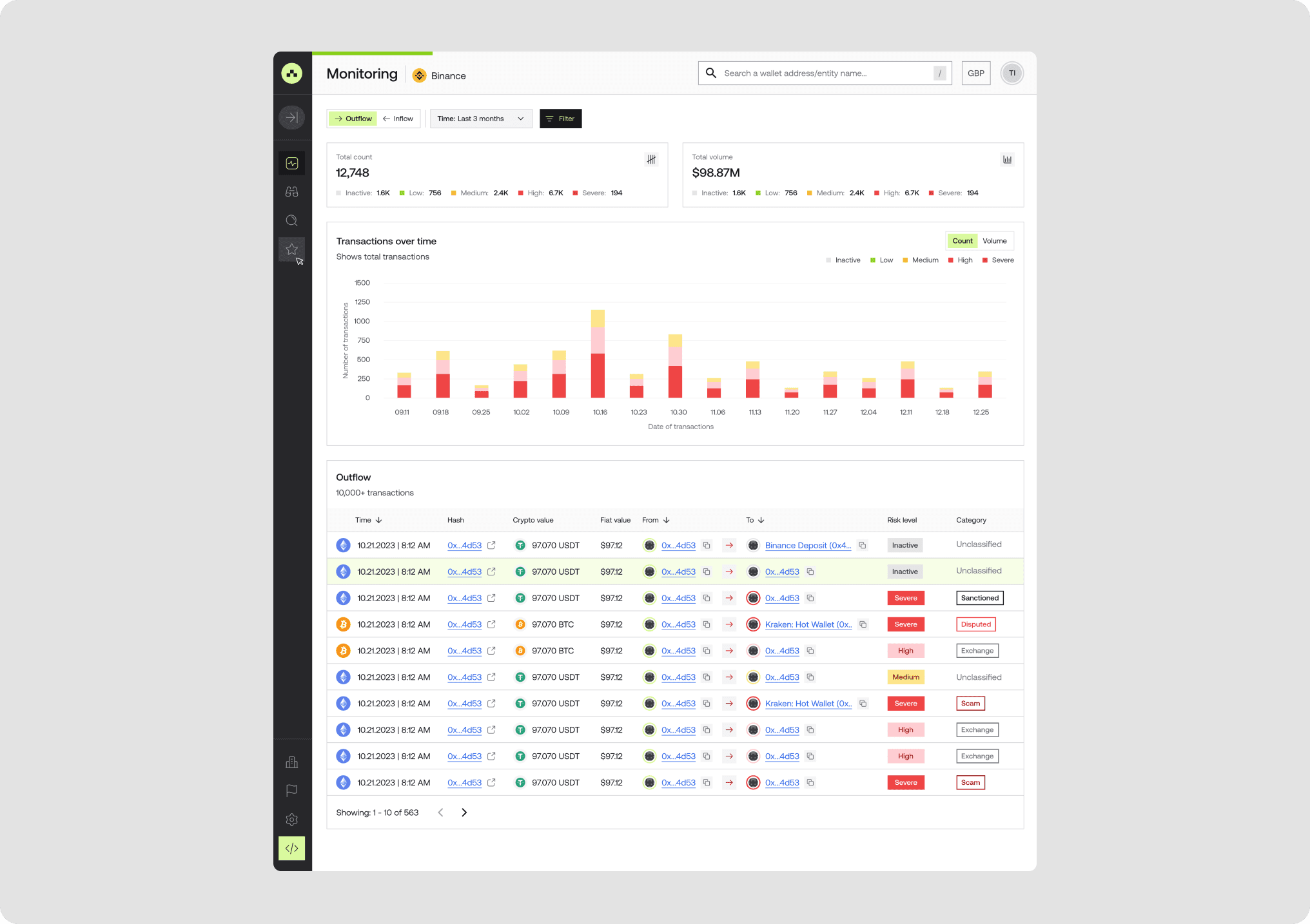
Navigation: improved page title, dynamic filtering
Chart: to show transactions over time, total scam amount is shown
Table header: improved header, total transaction count
Pagination: repositioned pagination
Risk score: changed risk score for a risk ring to better show the risk level
Design deliverables
Webapp for businesses
Design system for all reusable components (atoms, molecules, organisms)
API Docs
Key learnings
Continuous user feedback and iterative design are essential for optimising critical user journeys.
Speak to customers to get feedback on product usability
Outcome
After launch and granted product access to a couple of potential customers, we were able to sign a couple of big clients including Coinbase, Transak, Crypto.com, Binance. We have been able to help them reduces transaction losses from $7.2M to $2.9M while also hitting a $1M ARR within 9 months.
