
Eyowo is a digital platform enabling users to manage their finances via mobile phones. Any registered phone number grants access to an Eyowo account, allowing payments to be sent and received. Transactions can be conducted on the web, through a mobile app, or using a USSD code, offering instant utility bill payments, money transfers, and airtime purchases.
Launched in 2019, Eyowo aims to provide universal access to essential financial services. Internet access isn't required; anyone with a mobile phone can send, spend, receive, save, and borrow money through Eyowo.
Final solution
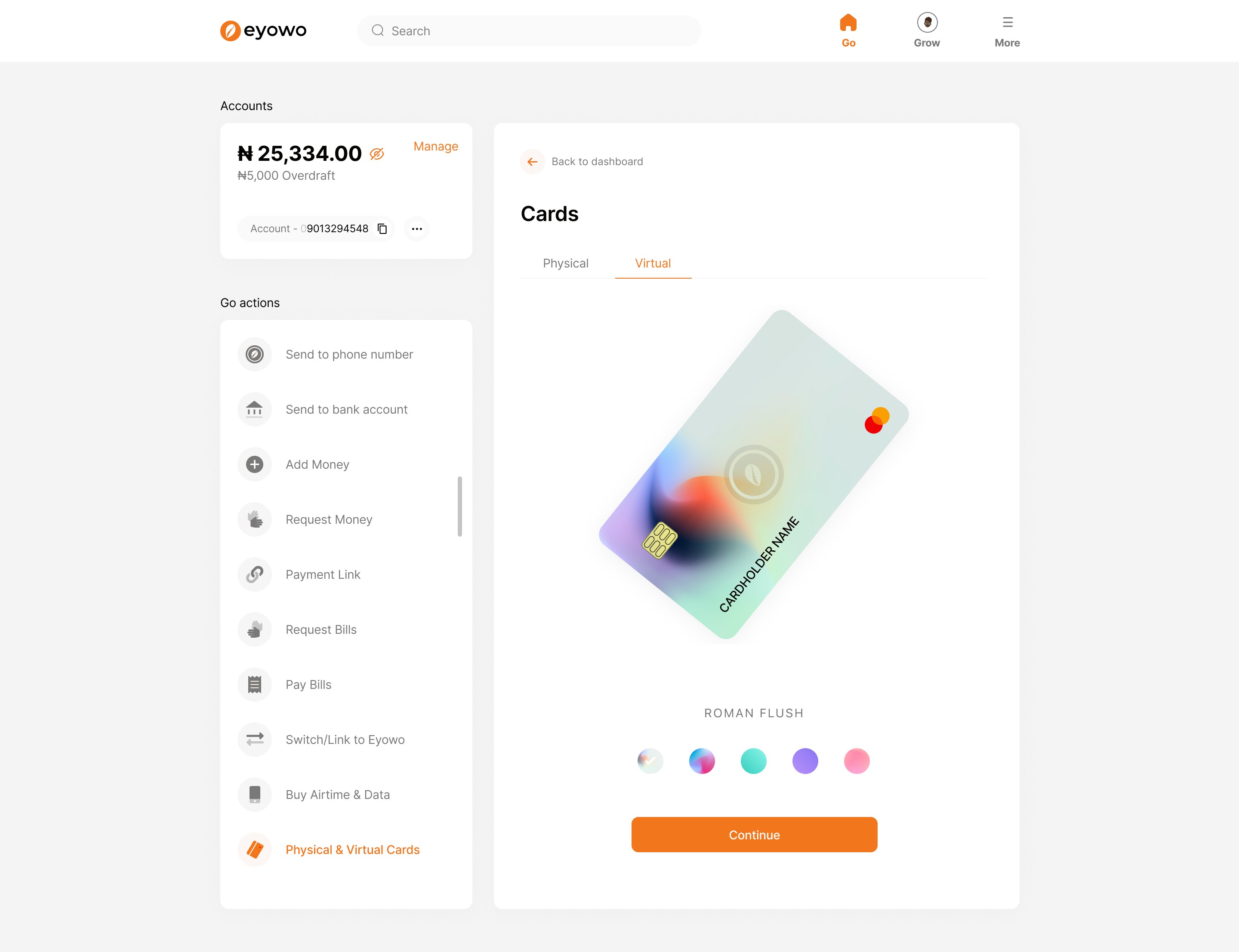
Screenshot from the final solution


What problem did we face?
Eyowo as a wallet is truly remarkable. In just 2 years, it serviced up to 4 million users and processed over ₦5 billion in transactions by 2020. It revolutionized peer-to-peer banking. However, as we scaled it into a digital bank, we decided to start fresh with a redesign.
The major breakthrough in our redesign was shifting our focus from simply "banking on your phone" to a more human-centric mission: "Inclusion and Human Growth" without compromise. We aimed to create a design that is simple to use, easy to scale, and fundamentally geared towards enhancing users' financial growth.
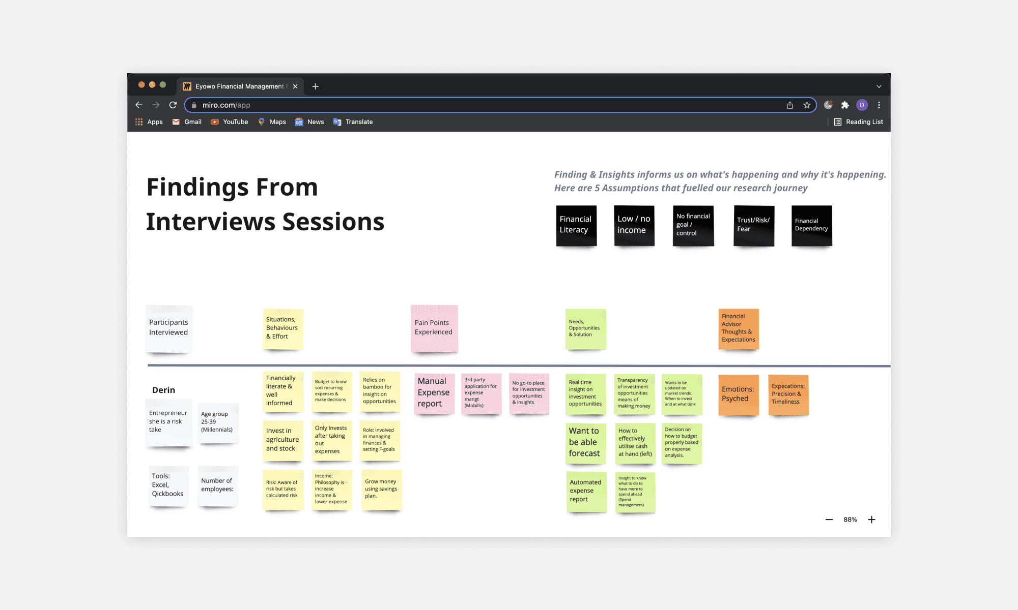
Some findings from the research
How did we understand the problem & creatively solve it?
Process:
User Research:
Conducted in-depth interviews with both successful and dropped-off users.
Analyzed existing customer data and feedback.
Problem Identification:
Initially hypothesized that reducing steps would improve completion rates.
Further investigation revealed trust-building as the critical factor.
Design Exploration:
Focused on redesigning all the steps
Developed multiple prototypes emphasizing transparency.
Iterative Testing:
Conducted quick A/B tests with different elements with customers.
Gathered real-time customer feedback on new designs.
Implementation:
Rolled out the redesigned web app with better experience & look.
Incorporated "trails" to help users understand .
Monitoring and Optimization:
Closely tracked completion rates and user feedback post-launch.
Continued iterative improvements based on ongoing user insights.
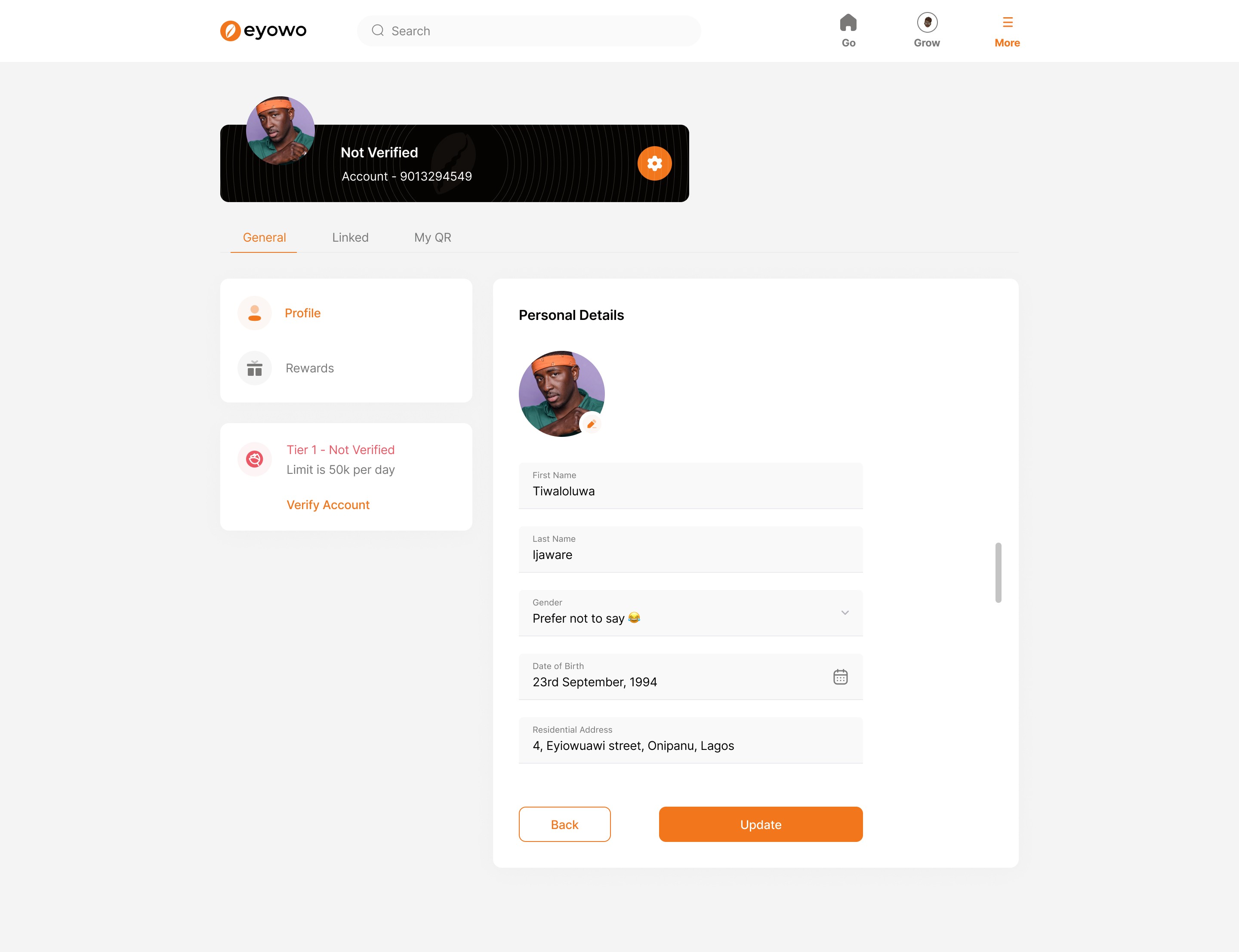
Some screens from the web app


Key learnings
Continuous feedback collection: receiving feedback at every stage of the process ensured better alignment with customer requirements and also making sure the stakeholders were carried on in the loop which significantly improved the entire design process.
Ensure design is easy to use: as much as we wanted to have a new design, we also made sure that it was easy to use and customers didn't have to search a lot to find features.
Outcomes
Following the relaunch, user satisfaction increased by over 75%, and the web app gained more than 125,000 active users. Additionally, the transaction rate saw a significant boost.
